Article Cards
Overview
1. Article Cards V1
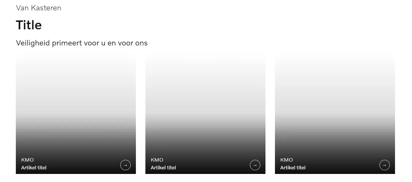
This block is a layout with an option to add several cards in a row.

Sample Article Cards block
General
There is a possibility to place up to 5 cards in a row. Simply click the 'Cards count in row' section and choose the necessary count that will be used for this layout. Don't forget to press the 'Save' button at the end to apply the changes.
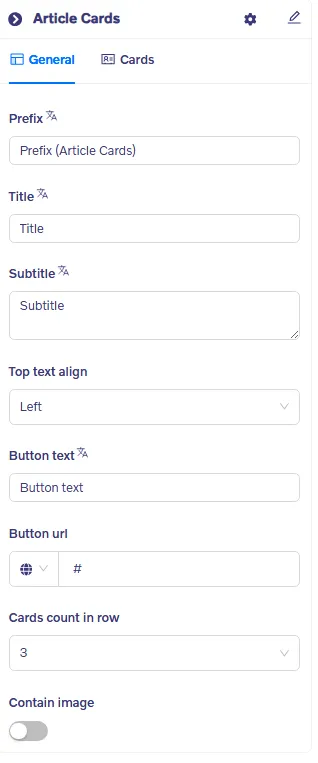
You can add / edit all text fields :
- Prefix : First text line (tagline text size)
- Title : Second text line (large text size)
- Subtitle : Third text line (small text size)
- Top text align : Select left, right or center
- Button + url : Add button title and external or internal link
- Carts in a row : Select up to max 5 Cards
- Contain image : Image contained in section
Cards
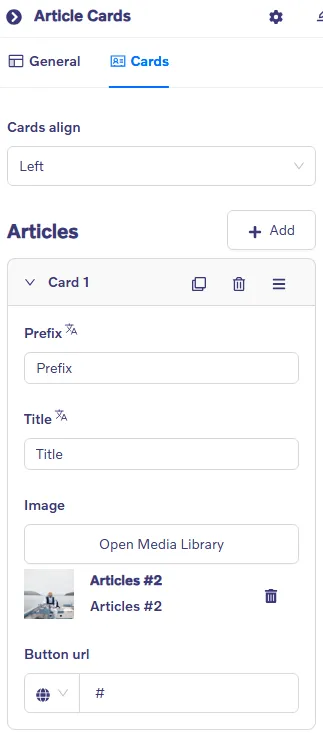
Content is added using Cards. Click on +Add to add more Articles/Cards. Set the Card alignment Left, right or center, using the "Cards align" dropdown.
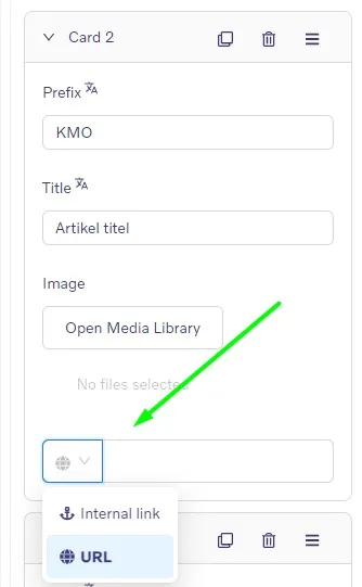
All images can be clickable and forwarded to the necessary webpage (URL or Internal link). Just click the 'Globe' button to choose the best option for you as shown below:
2. Article Cards V2
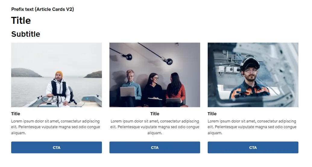
This block has the same purpose and the difference is the ability to add text under an image.

Sample Article Cards V2 block
General
There is a possibility to place up to 5 cards in a row. Simply click the 'Cards count in row' section and choose the necessary count that will be used for this layout. Don't forget to press the 'Save' button at the end to apply the changes.
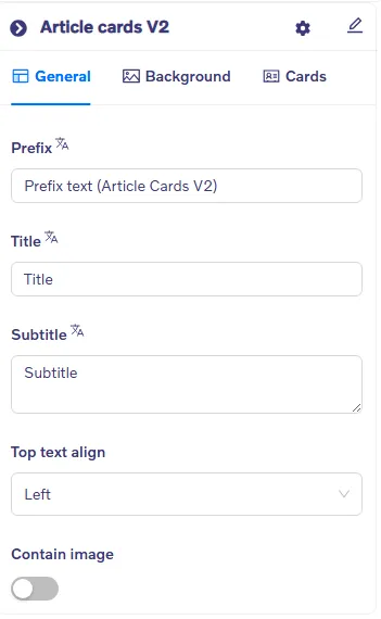
You can add / edit all text fields :
- Prefix : First text line (tagline text size)
- Title : Second text line (large text size)
- Subtitle : Third text line (small text size)
- Top text align : Select Left, right, center
- Contain image : set image display
Background
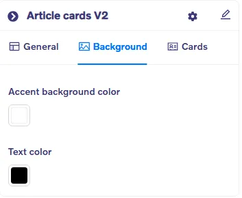
- Accent Background color : Set the background color
- Text color : Set the text color
Cards
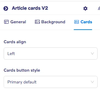
- Cards align : Select Left, right or center
- Cards button style : Select any of the 6 available button styles
Content is added using Cards. Click on +Add to add more Articles/Cards.
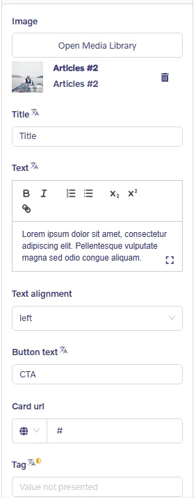
To add text that will be shown under the image you need to choose the 'Cards' section on the right and fill in the Text fields.
- Image : Upload media
- Title : Add a title
- Text : Add content
- Text alignment : Select Left or center
- Button text : Add text to be displayed on button
- Card url : Add internal or external url
- Tag : Add custom tags
3. Article Cards V3
This block differs from the first two with the ability to make one of the images bigger than the other 3.

Sample Article Cards V3 block
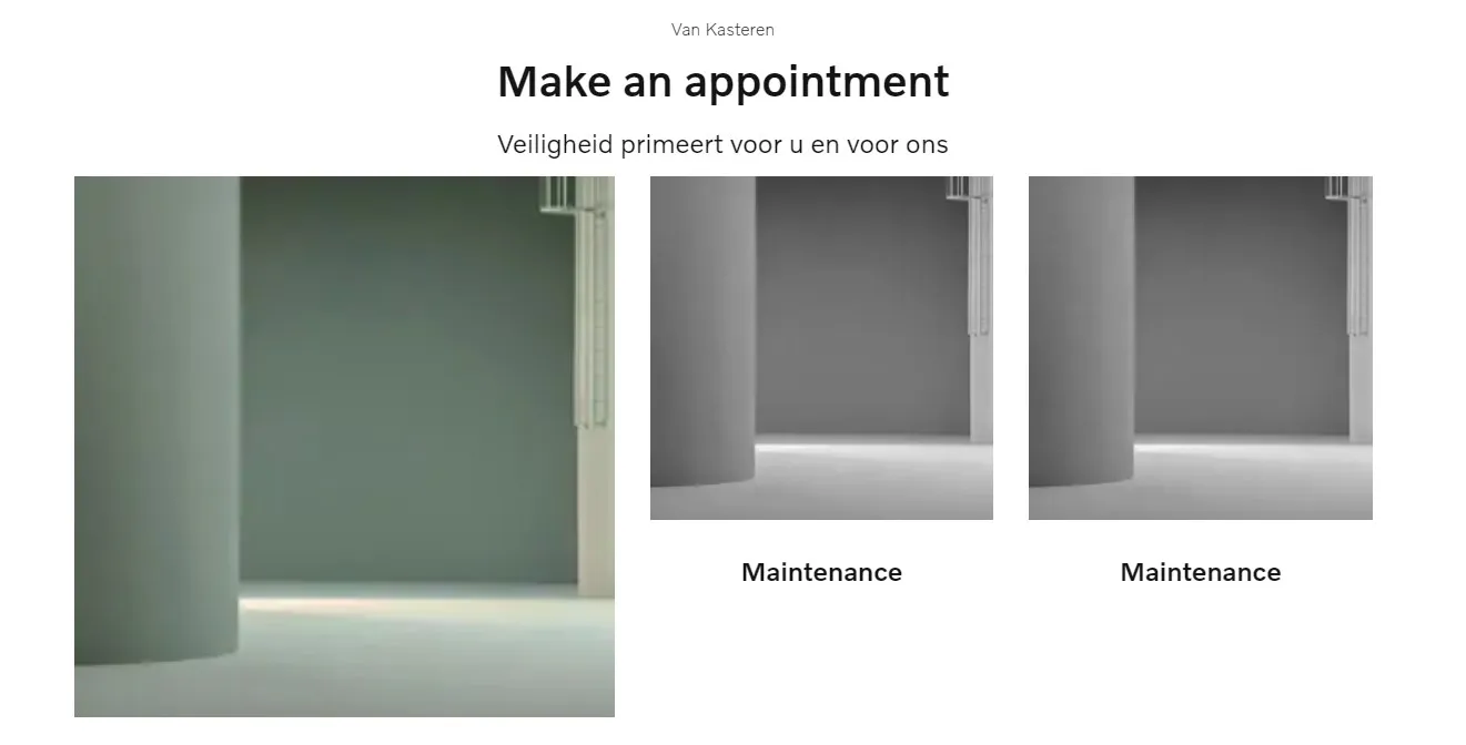
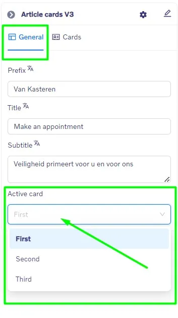
You can also choose which image out of 3 will be bigger by picking the Active card in the General section.
All images can be clickable and forwarded to the necessary webpage if you choose to set up the internal link or URL.
4. Article Cards V4
This block is similar to Article Cards V2. It also gives the ability to add image text to each card, though, the picture size is bigger than in Article Cards 2, and it is possible to add only 2 cards in a row.

Sample Article Cards V4 block
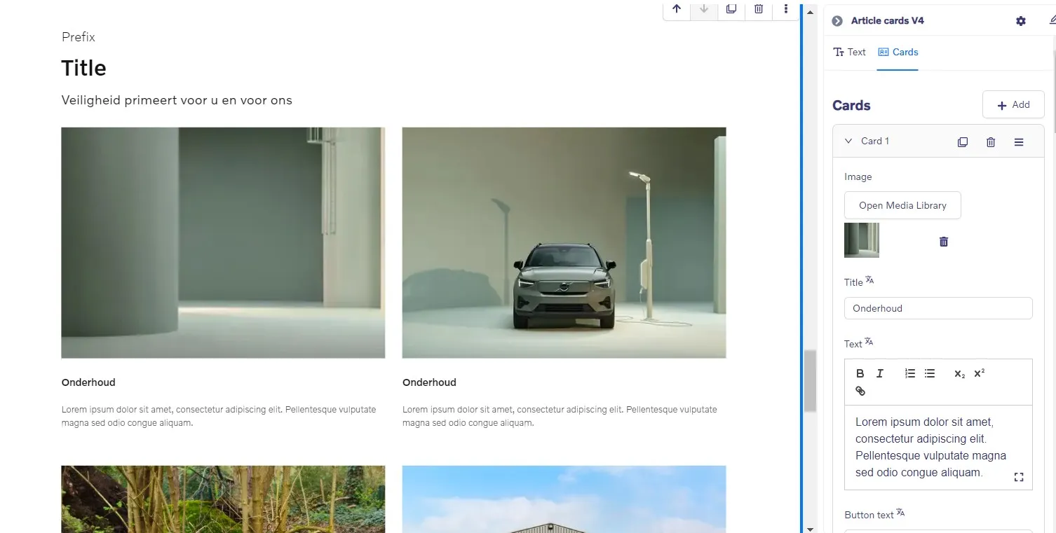
All cards can also be clickable and forwarded to the necessary webpage if you set up the Internal link or URL.