Header
Header is a configurable top part of the page, meant for comfortable navigation on your website. Basic social information is also displayed here.

As you can see on the screen, the Header is divided into 2 sections:
the Top Header and the Bottom Header.
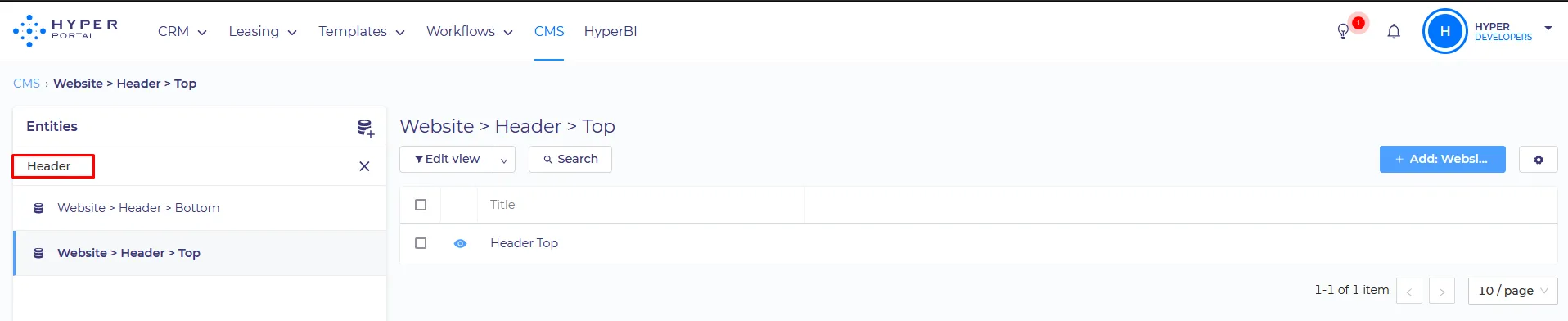
Both Can be configured separately in CMS, by editing
Website > Header > Top and Website > Header > Bottom respectively
SET UP:
Website > Header > Top
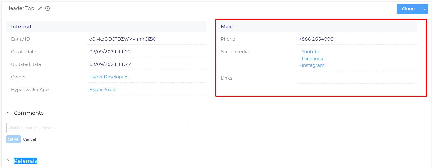
1. Phone – primary phone number to be displayed in the Header. Phone icon is added by default.
2. Social media – Here you can add any existing Social Media items to your header. Social Media Items are stored in the Website > Social Media entity.
3. Links - This field has similar functions to the 'Social media' field. But unlike the "Social Media", the items from this field are stored in a "Link" entity.
4. Languages - are displayed in the header by default. They are configured in the Website > Languages entity where you can disable or enable any available language.
*Important notice. If you change “show icon” or “show full name” options in any Language, you need to do the same for all Languages for the changes to take effect.
Website > Header > Bottoom
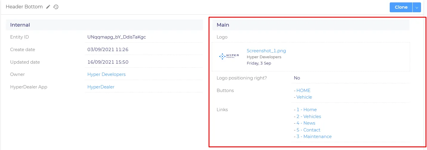
1. Logo - For displaying a Logo, you need to upload your image of choice. We recommend using the logo with a max height of 80px for the correct layout.
2. Logo positioning right? - Moves your logo to the right side of the screen in the header.

3. Buttons – custom buttons will be displayed in the right part of the Header. Buttons are managed in the Website > Button entity. Detailed instructions can be found below:
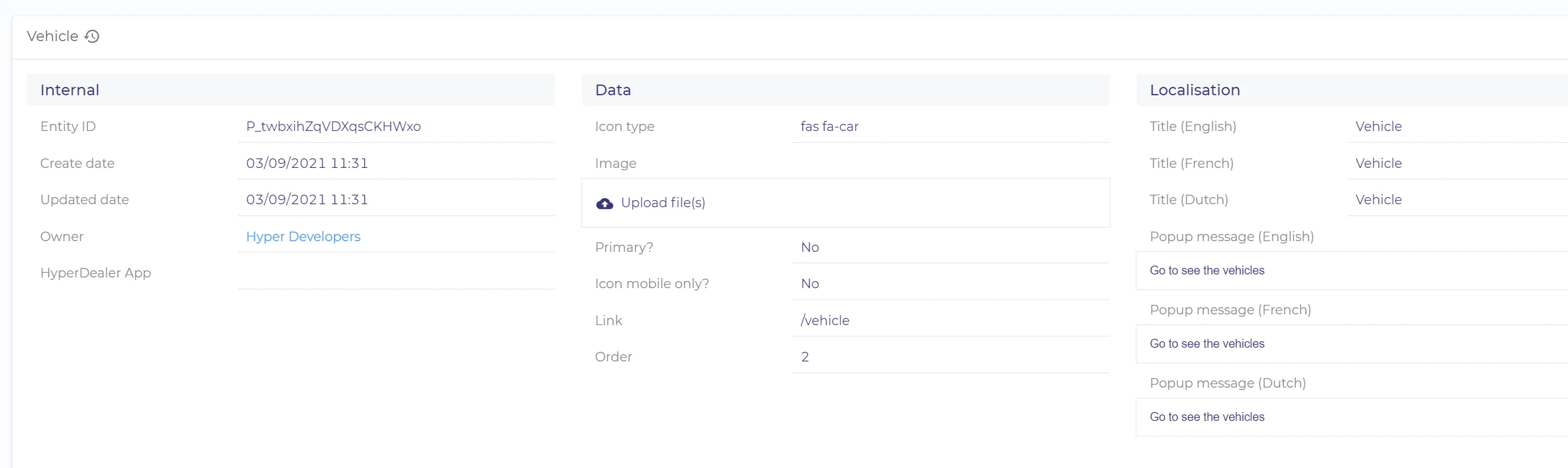
- Icon type – here you need to set the name of the icon that will be displayed on a button. The icon catalog can be found here
- Primary? - if set to yes, it fills the button with the primary website color.
- Link – link to where the button redirects the user. When you set an internal link to the other part of the site, it is best to use relative links (i.e. /about instead of ttps://dummydealer.digitaldealerpublic.dev/nl/about)
- Order – the relative position of the button, it`s applicable when you have several buttons attached to the Header.
- Localization fields – button text in each language
- Popup message – is set instead of a link. If the button has no link but has the popup message, this message will be displayed to the user on click.
4. Link – are shortcuts that allow your customers to quickly browse the website content.
Links are managed in the Navigation > Link entity.
Each Link item can have its own children link items, that allows you to organize links in sections.

In the header, you only need to add the parent Link items. All the children will be added automatically.
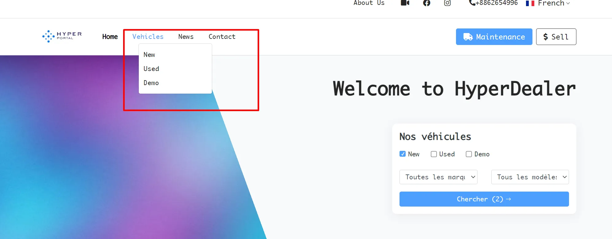
Important notice*
If the Link has children items, it will no longer be clickable, so you will be unable to use the link address for it.
We recommend using parent items as the section aggregators and children items as actual shortcuts to the needed part of the website. Same as for buttons, we recommend using relative links for Link items.